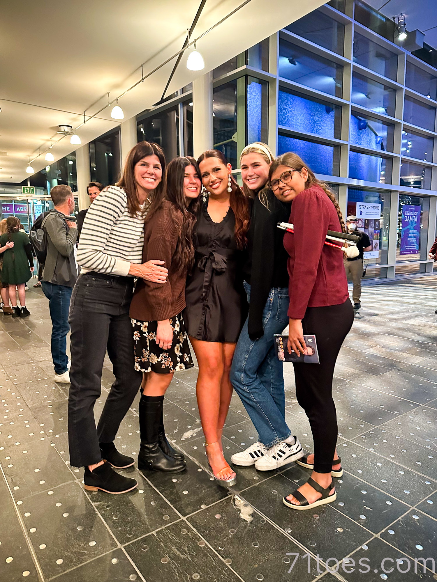
Well, I’m sure if you are here right now, you have noticed a “few” new things around here. Because it’s here! The new and improved 71toes! I’ve been so excited to share it with you!
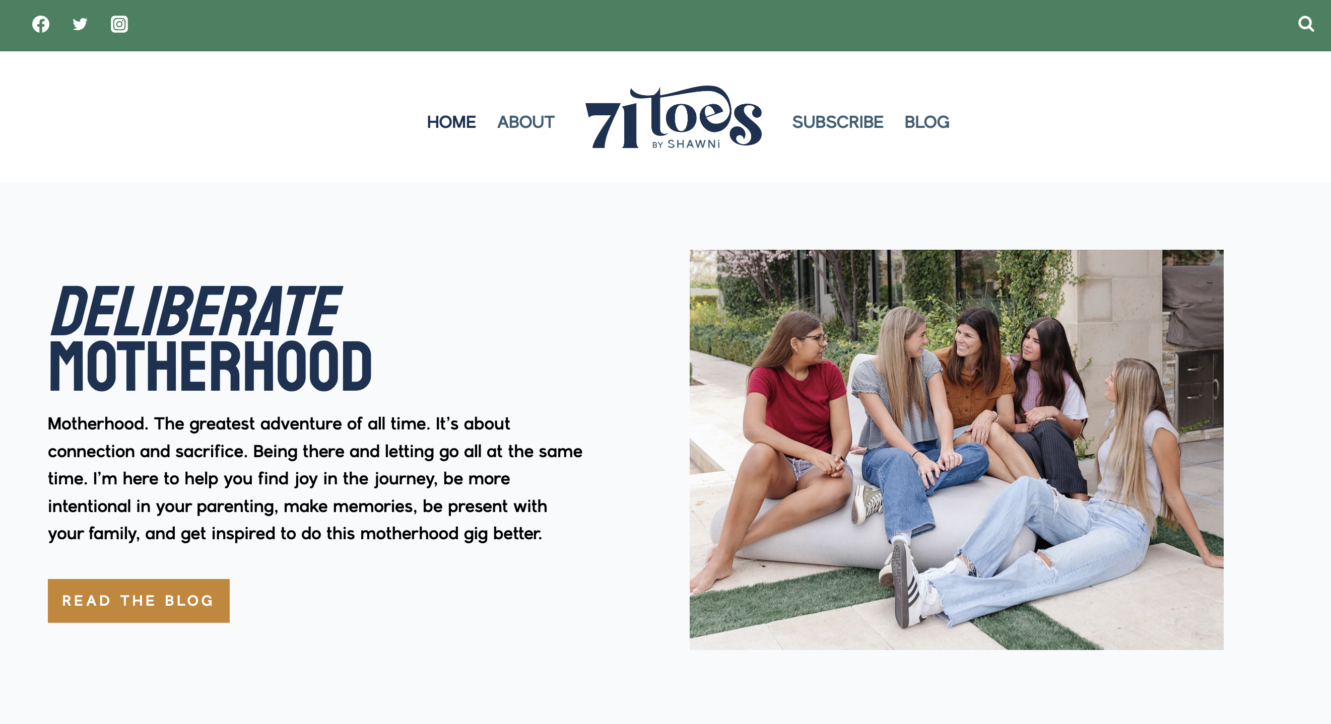
Such a special thanks to Carisa at Michelle Gifford Creative who has worked her magic over here. She has put in so much work and I’m so grateful for her!
I am so excited about the way all this new stuff, the way it’s so much easier to navigate to the main categories that got so lost before:
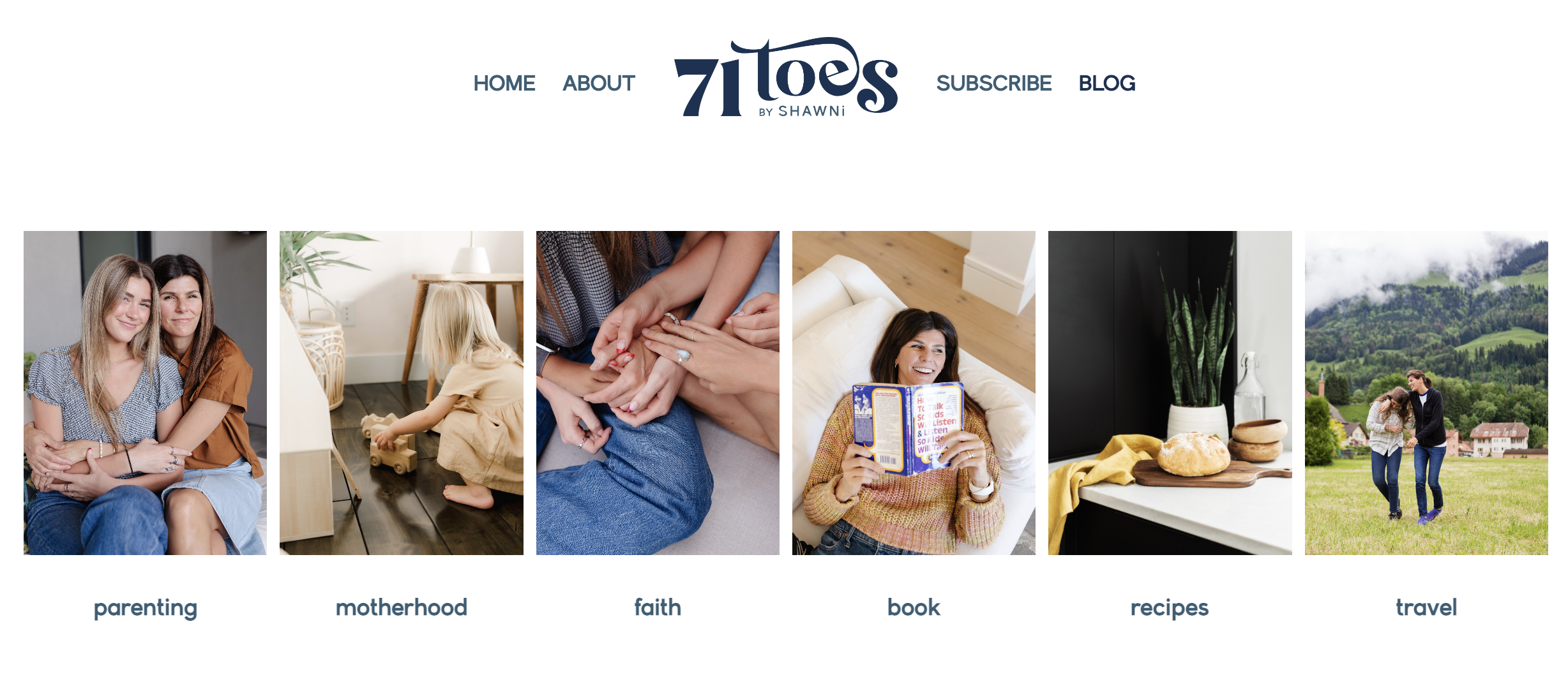
(You can just click on any of those and they’ll take you to all the posts in those categories.)
I like that it’s easy to find what in the world this blog is even all about.
I’m so excited about it all, but I would LOVE your honest input.
If you can take a look around and please share what’s working for you and also what’s not. We are still making some tweaks and I’d love any input we can get as we work for the next couple days working out the kinks. One thing I’ve noticed so far is that the blog posts don’t have much real estate (because of the larger header and footer), so we’re working on that. But we’d love to know your thoughts!
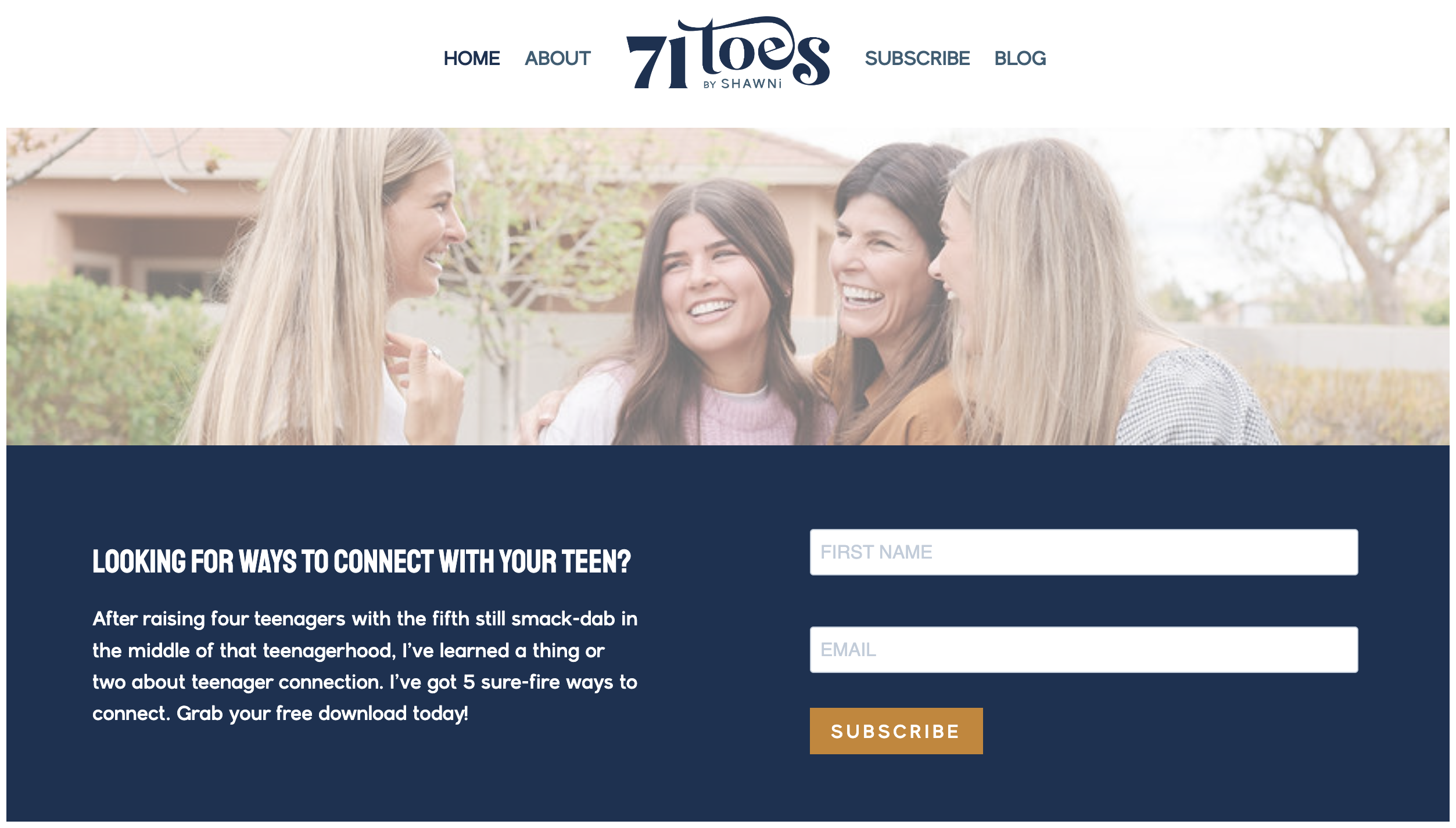
Be sure to subscribe because we’d love to stay connected and keep you in the loop with all that’s new over here. And also, I think you’ll like this document with five sure-fire ways to connect with your teenager.
Happy Tuesday night, enjoy browsing the new and improved 71toes!
Now to catch up with all the stuff that’s been waiting to be written about while we’ve been hard at work on this design!
XOXO

It looks BEAUTIFUL! Nice work!
On an iPhone, it’s hard to get to the “latest” blog post, which is what those of us who have been around for years want. Can you make the newest blog post right at the top and easier to find?
I agree. Totally beautiful, but took a minute to find this post.😘
I agree!
Agree! 71toes takes you to the home page which is great for those new to the blog, but doesn’t get you directly to the blog like it used to. I know this is the instant gratification time we’re in, but I would probably honestly not check the blog as much. I know a revamp can be fun, but I liked it just fine how it was. Hopefully that can be tweaked a bit 🙂
This was the first thing I noticed too! We need more “real estate” for the blog to show! Definitely working on fixing that! Thank you for the feedback!
Xoxo
Where did you find the picture of Jesus in the boat? With the blue sky full of stars? I LOVE it and would like to have it in my home.
I love that one too and just found it on Pinterest. I’ll see if I can find the artist.
Xoxo
Shawni it looks great! It looks new and fresh! We look forward to your continued insight and wisdom. Your blog makes such a difference in my day! Happy Wednesday.
Thank you Tammy!
Sadly, change isn’t ever my favorite! I need as much in my life on autopilot I can get -esp. to make anything on the internet worth it. Way harder to navigate I think and overwhelming. I’m in the “if it’s not broken don’t fix it camp. LOVED YOUR BLOG just how it was. Just my 2 cents worth. BEST WISHES!
I appreciate your “two cents” so much! Working on all this to make it go more quickly to the blog❤️🙏🏻🤞
This might actually be my mom commenting, as her name is Joy, but it is exactly how I feel. I think what you wanted was to make things more search-able and accessible which seems easy to do just by adding a drop down menu. All these changes just make it really less fun to read. Your old format allowed me to run into things I didn’t even know I needed or wanted and now I have to come here “looking” for specific things. Not a fan. And honestly I don’t think it is more beautiful. Change is hard and if you keep it, we all will have to adjust. It is your platform and we just get to choose to enjoy it or not. It does turn me off from reading though. I know you will iron things out more too. I just really didn’t think it needed an overhaul. Maybe just a better drop down search menu.
Yes having the most recent blog post at the top would be great! Took me a second too.
I love the new design but it is very hard to read the posts – between the header and ads on the bottom and sidebar (which are constantly moving and flashing and seem impossible to turn off), there is about 7 inches x 3 inches where the actual post appears – on my 12 x 7 inches monitor. (I had a ruler handy lol).
This was one of my biggest worries too. Working on that hopefully will be better by the end of the day.
Xoxo
I agree with the comment. The banner and the ad at the bottom makes for about 3 inches of screen for the actual blog post on a 13″ MacBook Air.
I came to leave this exact comment! Beautiful design, but very difficult to read your blog post text and view your beautiful photos (especially vertical ones) when the actually viewing space is quite small. Cheers to the growing edge and evolving so thoughtfully! 🙂
Thank you everyone for sticking with us through this little remodel. Lots of tweaks still coming. I really appreciate the feedback, keep it coming!
A little harder to navigate. I like quick and simple and not too staged. Thanks for all you do in the parenting/mothering world.
The aesthetic of your new page is great and the photos are gorgeous! I also prefer landing on your latest blog entry… I like to pop over here when I have the time and see right away if you’ve posted something new.
Love this! 🙂
Took me 3 different visits to your new site before I could find the latest blog post. The site looks beautiful. The categories are great if looking for something particular.
Current blog post needs to be front and center
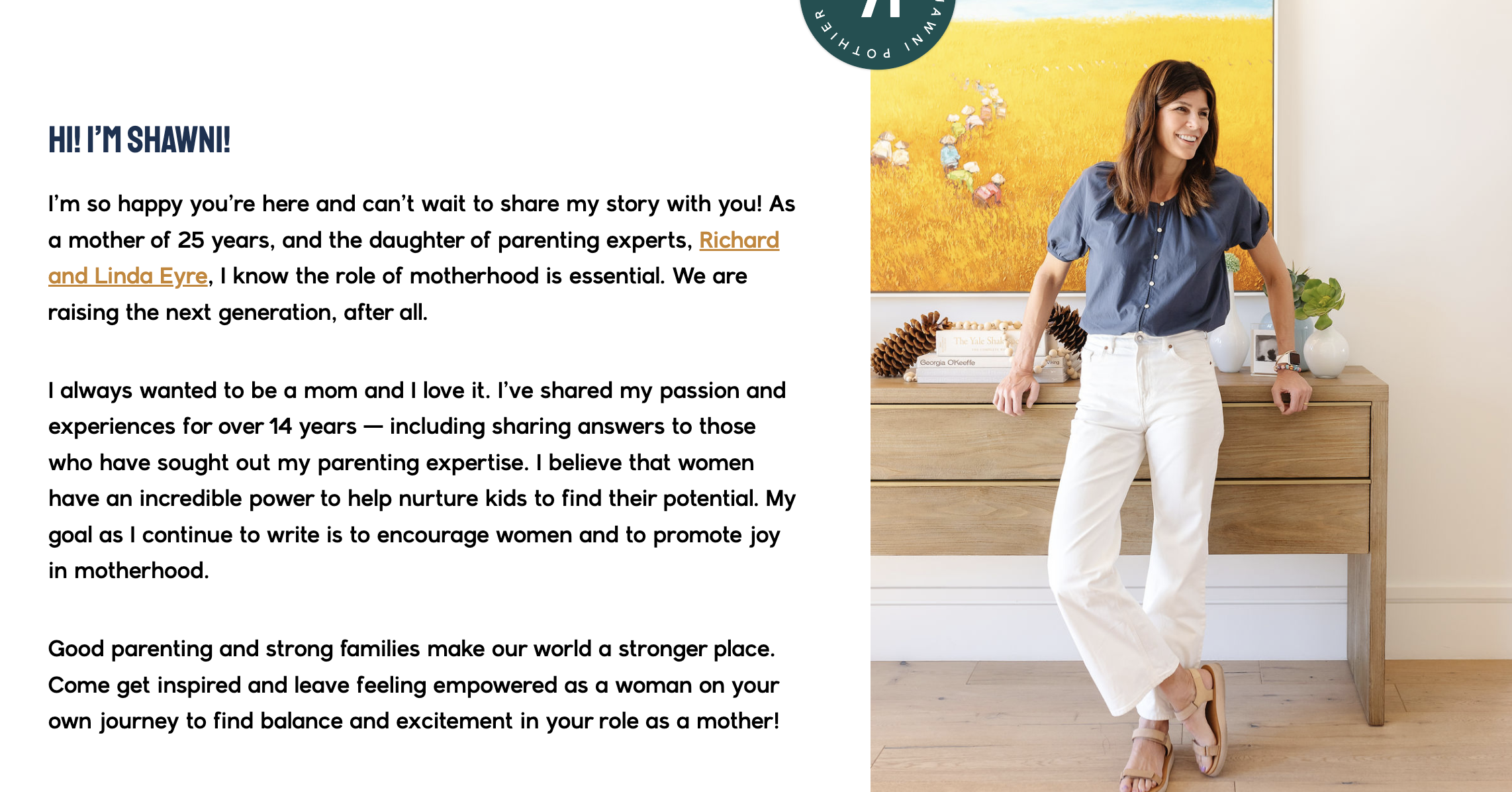
This website feels like a more “branded” experience now. Looking at your designer’s page, I see that it has a very similar feel (so more like a business). Before it was a blog with categories and gave off a personalized touch. Now the blog seems like just one aspect of it, since I have to click to get there from the home page. If I scroll past the other non-blog topics on the homepage (the download, podcast, and book “ads”), I get back to other blog topics…but I can’t really tell we’ve returned to blog stuff. They could be more business categories? Essentially, it has more of a business feel than a personal blog, and newcomers might not stay for the blog if they think this is a business site. Does this make any sense at all? (Perhaps, this is what you were going for.) Also, is there anything different between the “BINGE READ” and “READ MORE” buttons? I don’t think so, but by naming them differently, it could suggest they don’t do the same thing.
I totally agree! It feels overly stylized and “fake” – as in too good to be real. It’s like we lost the feeling of being behind the scenes, and now it’s just ads and pretty smiles.
This describes my first impressions, too. I miss seeing the candid pics of the family!
Yes, this! There is a LOT going on, and it isn’t intuitive to navigate. I am already nostalgic for the old site ~ simple, sweet, and comforting. It felt like chatting in your kitchen!
It looks great!
I love that your recipes are easily accessible now.
I agree with some of the others I would prefer to see a quick link to blog as it felt a little cumbersome looking for it.
Kudos on the new layout and design!
It took awhile to find that you had posted anything new—I’d love new material to be at the top so I see it. I see other people have mentioned that too, so you may already be working on that.
I noticed that on the “HOME” page, toward the bottom, there is a section for recipes. Then there are different headings like “salad” and “dessert” but you can’t click on these. Unsure if they are supposed to take you to specific pages.
Love having the recipes as a category. I’ve gotten some good ones from you in the past and live having a way to find them easily now.
It feels less user friendly and a bit…corporate, for want of a better word. I would guess most of us visit to read your latest blog posts, those are now harder to find, which is frustrating. I know this is laziness on my part, but a site that’s hard to navigate will have me checking in less often; if ever, even though I love your blog updates.
I also think there are far too many headers/read more sections…and the description for each one is far too long. It feels cumbersome and confusing.
I do love having the recipe links more readily available.
I enjoy your blog and have been a reader for many years. I understand that personal branding is important and respect your desire to focus on motherhood—a great choice, given your experience and tie-in with your family’s other businesses and activities. I am not a mother, so if I were to arrive on your landing page for the first time, I would probably keep moving because I wouldn’t think your content would be relevant to me. The design is beautiful and the content categories are easier to find. Thanks for putting yourself out there and sharing your and your family’s lives with us.
I echo comments made above. I visit your site to read your latest blog post and see your beautiful pictures. This version feels less personal and less engaging. For me it was difficult to find the latest blog post, and all of the scrolling pictures, categories, and ads were too much. Your website’s strength is in your words and images — would love to see the design more focused and streamlined around them.
The new design is beautiful! I mostly read from my phone and noticed there isn’t a search bar anymore. As someone who is searching for specific posts (especially recipes!) that makes it a little tricky. Definitely add a search bar on mobile if you can!
For the blog tab, I feel the information shown is a bit repetitive and overwhelming to take in. I think the category section looks great and visitors would understand to click on the pic if they want to read more. The 4 main pics with blog post is confusing to me. If i were visiting for the first time I wouldn’t know they lead to the latest posts. As someone who reads all your posts, it’s harder having to scroll to the new on the blog section. t would be nice for the post date to be shown too. T
For the blog tab, I feel the information shown is a bit repetitive and overwhelming to take in. I think the category section looks great and visitors would understand to click on the pic if they want to read more. The 4 main pics with blog post is confusing to me. If i were visiting for the first time I wouldn’t know they lead to the latest posts. As someone who reads all your posts, it’s harder having to scroll to the new on the blog section. t would be nice for the post date to be shown too.
I respect your desire for change and a little fresh look, but I don’t think this was the way to do it. I strongly dislike everything about this revamp, from all the ads to the difficult navigation to the crowded, busy, overwhelming pages, to lack of search bar, even right down to the font, which is harder for me to read. I know that this is your space and you can absolutely do what you please, but I am very saddened that my favorite blog is no longer pleasant to visit, and feels like a business website instead. Newer is not always better, and I think a previous commenter really hit the nail on the head when saying your words and pictures were your strengths. I do so hope you’re able to look at these comments from your long time readers, many of which I’m just echoing here, and restore the blog to something we so greatly enjoyed,
Thank you ❤️
Hi Shawni! I have been a long time reader, love your family, your stories, recipes, perspective and words. I have to agree with the previous comments. The new site is hard to navigate! Harder for me to follow, font is trickier to read, lots of ads and so much extra fluff.
I do have a couple of suggestions on the search feature as well-I’m a couple years behind you in parenting and like being able to search up a time, trip or experience and read your perspectives on that time instead of trying to scroll back 7 years. I would love if it the search was available and a lot more intuitive.
I’m not sure what the end goal is but like a previous commenter mentioned-we love YOU! We come for you words, candid photos and experiences, shared family moments, beautiful house ideas, yummy recipes and real life. We don’t need the extra fluff.
Thanks for sharing your beautiful life with us!
Rebranding is not easy, and requires an understanding of what your audience wants. In this age of “aesthetic” everything, I understand the desire for a personal “look” and trying to find an aesthetic that is representative of you as a person as well as your online presence. In this case, it seems like the focus on having a new look and making the blog into a business page completely overshadowed and took away from the real reasons many of your readers have been here for so long. Looking at your readers’ responses about what they would like to see more of from a refresh, I don’t think one person said they’d like a fresh, new site. Rebranding only works if the current users like it (which most seem not to), or if it is trying to appeal to a new group of people (which I don’t believe is the intent). You have a truly special thing here, a blog community of many years, and it would be a shame to lose that. It’s a bit disappointing to see how the site designer modeled this page after her own aesthetic and business page instead of capturing who you are as a person. Perhaps your talented daughter can use her more minimalist design visions and restore the blog to something that really captures you as a person and is more user friendly.
We love following your life wnd hope to continue doing so!
I have read your blog for years and years, like most people and I couldn’t find one comment where someone was in love with the design. It is not user friendly, is so hard to read and covered with ads. I get a new design, but maybe simplify it and take away some of the constant flashing ads everywhere. and give more space for the blog post to actually show, I couldn’t see one full picture with the readable space.
I’ve already commented, but I did want to add that the ads are starting to drive me NUTS! Also, just a QA thing….the links to FB, Twitter, and Instagram at the top left don’t work. They direct you to the page you are already on.
I just want to say how appreciative I am that you’ve asked for feedback on this “revamp” and I think means a lot to many of your long time readers. It’s never easy to make a big change, especially when it’s one that’s been as unpopular and generally disliked as this one. I hope you don’t get discouraged at the overwhelmingly negative response to the new format. I have seen something beautiful here which is your readers all saying that they came for YOU(!!!) and not a busy, overwhelming professional business site. I think it’s actually a great compliment- many businesses and bloggers rely on something other than purely what they have to offer, and your readers have shown you this week that they love you just how you are and when you present your most authentic self. Your blog is so special, Shawni, and I know many folks feel that we’re all “friends” in a way. I hope this feedback is able to help clarify a new direction for the blog that more accurately represents you as a person and draws more readers to your beautiful blog. Thank you for your vulnerability and humility through this process, and (with patience and understanding) I look forward to seeing what changes come of this informal research & development marketing session 🙂
Aw thank you soooo much for this sweet comment, and for all the other ones as well!
The designer and I have had some good conversations and hopefully more changes will be coming within the next day or two. Instead of replying to everyone separately I’ll just say I want to validate everything you have said, I’m with you 100% and working on it all. We may have to have a few rounds of adjustments and I’ll appreciate more feedback as they come.
Thank you all for the encouragement and love!
XOXO